Process notes
Week 02 rewrote the synthesis as a short “bookend” text and built the first version of the symposium presentation, Fitted Rather Than Read.
The bookend names the weakness of the △1–△2 work: a re-editing method that works on any source may carry no position of its own. If any material would do, my position lay not in the material but in the arranging — in the frame that decides where things go before they arrive. That frame is what Timetable and Out of the Picture share, and its most basic form is the grid. So the enquiry returned to the grid itself.
Two references moved it. Lisa Gitelman: “by dividing mental labor, blanks make bureaucracy” (2014, p. 30). James C. Scott treats legibility as a central problem of statecraft (1998): the same word is a tool in design and a condition in administration. A grid is planned before anyone fills it; it is fitted rather than read.
Demo video
Tutorial feedback (5 November)
- Video narrative is one of the strongest parts of the practice: it brings the material to life in a way the slides do not.
- The canon of the grid is a very Western way of looking at graphic design. “Universal” should itself be questioned: different scripts and cultures have organised text differently, and any canon is a way of categorising good and bad design.
- Show more examples instead of generalising, and clarify what “framing” means.
These comments became the “universality” half of the written title and the multi-script grid test in Week 03.
Selected process fragments
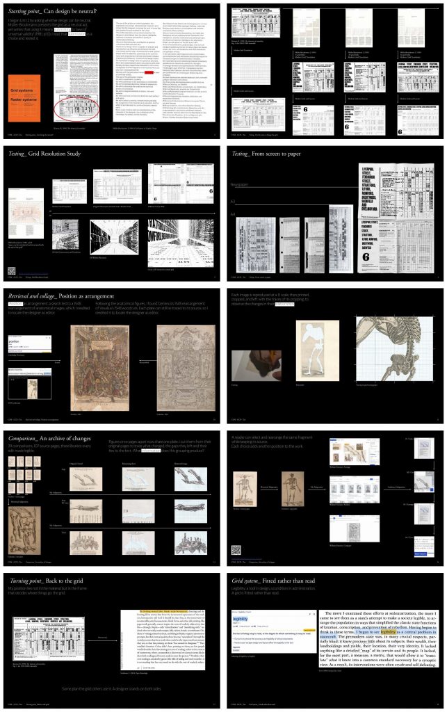
- Starting point: can design be neutral? — Müller-Brockmann presents the grid as a neutral aid, yet writes that using it means “submitting to laws of universal validity” (1981, p. 10). Source PDF, page 2.
- Fix the source, change the grid — The 1928 LNER timetable from Kinross set in Müller-Brockmann’s 8, 20 and 32 field grids. Source PDF, page 4.
- Grid resolution study, 2D and 3D — “Space can be articulated and structured with the aid of the grid” (Müller-Brockmann, 1981, p. 148): the timetable as a spatial website. Source PDF, page 5.
- From screen to paper — Newspaper, A3 and A4: what the same timetable loses at each format. Source PDF, page 6.
- Position as arrangement — The dialogue showed that legibility is composed by arrangement; following “position” led to Geminus’s 1545 rearrangement of Vesalius. Source PDF, page 10.
- Cutting, remainder, tracing — Images reproduced at 1:1, printed and cut, with the traces of cutting kept. Source PDF, page 11.
- An archive of changes — 39 comparisons, 107 source pages, three libraries: every edit made legible. Source PDF, page 13.
- Select, cut, arrange, trace — A reader can rearrange the same fragment while keeping its source; each choice adds another position to the work. Source PDF, page 14.
- Turning point: back to the grid — Some plan the grid; others use it. A designer stands on both sides. Source PDF, page 17.
- Fitted rather than read — Legibility: a tool in design, a condition in administration (Scott, 1998). Source PDF, page 19.